Project - A Melbourne Dental Clinic
Whether you realize it or not, the moment a client walks through your doors, they begin forming an impression of you and your business. Your workspace tells a story, conveying information about your professionalism, capabilities, and work style.
See how we improved the customer experience at a renominated dental clinic in Melbourne…
Whether you realize it or not, the moment a client walks through your doors, they begin forming an impression of you and your business. Your workspace tells a story, conveying information about your professionalism, capabilities, and work style.
See how we improved the customer experience at a renominated dental clinic in Melbourne.
Background
Endodontic Associates is a highly professional clinic in the heart of the Melbourne CBD. Associate Professor Mark Evans and business partner Dr Jeff Ward have helped their patients with specialized Root Canal Treatments for many years. Mark is also heavily involved in teaching postgraduate students at The University of Melbourne.
When we saw their rooms for the first time, we immediately noticed the bare walls in the entrance/waiting area and two outdated images on the reception wall.
Mark and Jeff had thought about adding wall art several times, but with a busy work schedule never got around it.
That’s when Wallgood took the lead.
Curation
Mark and Jeff were looking for a minimalist approach, other than that left the curation entirely up to us. With this in mind we looked at suitable artwork, taking the genre of their profession, the existing elements of the rooms, and the location of the clinic into account.
We suggested three options each for the entrance/waiting area and the reception. These could be combined in any way.
They were presented as digital mock-ups so Mark and Jeff could visualize the art work in place.
Entrance/Waiting area
Option 1
We suggested photographs by Ulrike Perkins from the series Woodlands. Ulrike's unique forest images are colorful and engaging. Most of them are taken locally. The abstract interpretation reflects the essence of our beautiful Australian forests.
Nature scenes are known to have a calming and relaxing effect on the nervous system. The colors and style of this series fit in well within the existing elements of the space.
They are printed on vibrant archival paper and mounted behind high quality plexiglass. The finished artworks have non visible hanging attachments and appear to be floating on the wall, giving an elegant and professional look.
Option 2
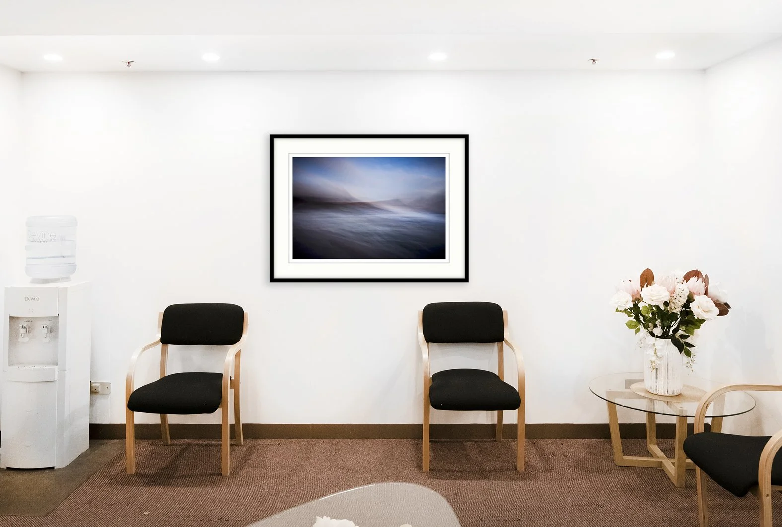
Alternatively we proposed photographs by London based artist Mark Cornick from the series Fathom. The abstract seascape images were taken at the Cornish Coast.
Again the colors match the interior and these simple and open ocean scenes have a calming and pleasing quality. Their wide horizon helps expand the room.
The images are printed on archival cotton rag and hung in classic black wooden frames for a more traditional and sophisticated look.
Option 3
A third - non photographic - option were artworks by Sydney multimedia artist George Hall. George’s work is fluid, colorful and uplifting. His paintings reflect the dazzling colours of Australian nature. He incorporates layers in mixed media, acrylics, collage and glazes.
The images are engaging, while also having a calming and grounding effect.
The square images Gradual Land and Garden Series are limited edition reproduction prints, signed by the artist and framed in simple black wooden frames. The large picture named Silent Grass is an original artwork on canvas, surrounded by a raw oak frame.
Reception
Option 1
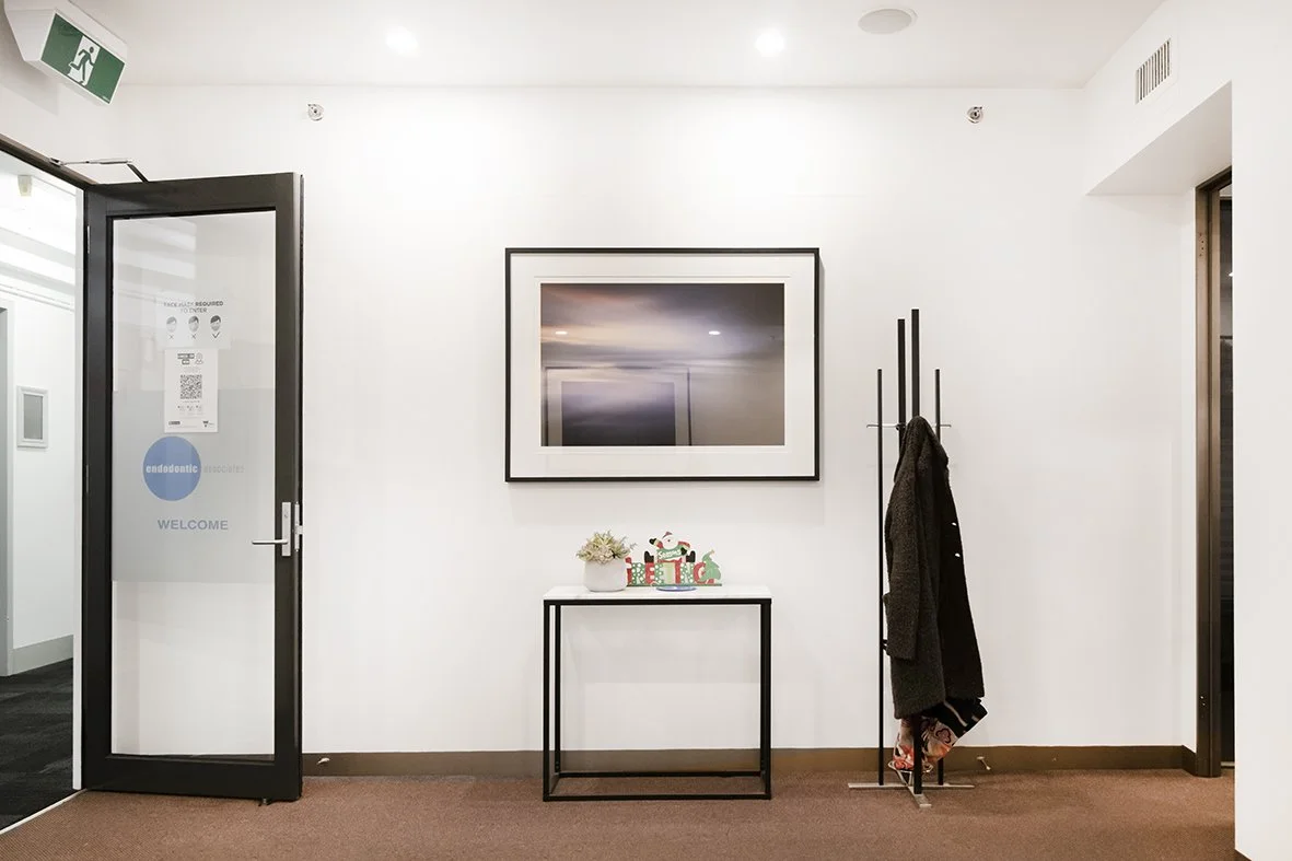
These medical rooms are situated in the heart of Melbourne. We wanted to reflect this unique location with a beautiful photograph by local artist Jono Marthick. The image of a tram - iconic for Melbourne - could have been taken just in front of the building. The magical lighting is an eye catcher and easy conversation starter.
The images are printed on archival cotton rag and framed locally using beautiful raw timber.
Option 2
This was an addition to Option 1 above. Adding another photo from the colorful series Woodlands would result in a consistent and elegant look throughout the space.
Option 3
Alternatively we suggested a photograph by Canadian artist Daniel Castaguay, called The Entrance. Daniel is a true master of capturing the life and soul of the streets. Transmitting an emotion is the essence of his photographic work, bringing the viewer into a story and leaving space to imagination.
The image is printed on archival cotton rag and framed locally.
The finished rooms
Mark and Jeff liked the local aspect of the tram image for their reception area and chose the abstract seascapes for their entrance/waiting area. What a beautiful final result!
Thank you Mark for the wonderful review:
”Uli was very patient with us, as we were very indecisive about what was needed to improve our waiting room and reception area. She gave us several options, all of which would have worked, and we are thrilled with the final result. We never felt pressured and the artworks have really lifted the look of our practice as patients enter the waiting area. Uli's curatorial skills are spot on, and the number of pictures and their placement is perfect. We could never have put together artwork in such a way ourselves and I can highly recommend Wallgood.”
The power of colour on our mind, mood and behaviour
Colours are more powerful than we think. They influence our thinking, inspire our decision-making, and impact our moods.
62-90% of a first impression is due to colors.
Colours can make us feel happy or sad, tense or relaxed. They can give us a sense of security and confidence…
Colours are more powerful than we think. They influence our thinking, inspire our decision-making, and impact our moods.
62-90% of a first impression is due to colours.
Colours can make us feel happy or sad, tense or relaxed. They can give us a sense of security and confidence. They can even provoke hunger or boost our energy. These reactions are rooted in psychological effects, biological conditioning and cultural imprinting.
Lets see how different attributes of colour can effect our brain and behavior.
1. Warm colours
Red, orange and yellow are considered warm colours. Warm colours often evoke feelings of happiness, optimism and energy. Red draws attention like no other color and motivates us to take action. Orange is a youthful and energetic color, it is optimistic and uplifting, adds spontaneity and positivity to life and encourages social communication and creativity. Yellow makes learning easier as it affects the logical part of the brain, stimulating mentality and perception. It inspires thought and curiosity and boosts enthusiasm and confidence.
2. Cool colours
Cool colours include green, blue, and purple. Cool colorus are usually calming and soothing and stand for trust and security. Green is universally associated with nature. It is a generous, relaxing color that revitalizes our body and mind. It balances our emotions and leaves us feeling safe and secure. It also gives us hope, with promises of growth and prosperity. Blue - associated with the sky and water - has a calming and relaxing effect on our psyche. The color stands for trust and loyalty, confidence and security. Purple - a mixture of blue (calm) and red (intense) is often used to help spark imagination and creativity. It is also associated with royalty and luxury.
3. Energizing colours
Strong and bright colours can boost our energy and make us feel more alert. These colours stand out from their surroundings and grab our attention. Red, the most dynamic color by nature, tends to be the most stimulating one. It causes the body to pump out more adrenaline and speed up our heart rate. Purple and yellow can have a similar effect. Being surrounded by energizing colours stimulates our minds and can encourage conversation and collaboration.
4. Calming Colours
Cool colours like blue and green and pastel colours have a calming and relaxing effect. Green is present in most of the spaces we visit when we want to feel relaxed like parks and quiet forest. Neutrals like white, beige and grey can also make you feel calm. The fewer colours are combined and the more simple they are presented, the more calming they will feel.
5. Happy colours
Happy colours are bright, warm colours like yellow, orange, pink and red. Pastel colours can also have an uplifting effect on our mood. The brighter and lighter a colour, the more happy and optimistic it will make us feel. Combining multiple primary and secondary colours is another way to create happy emotions. Think about a rainbow!


